Geek

Interface.

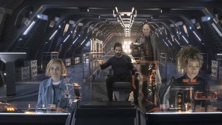
Photo from TrekMovie.com

I know producers of science fiction movie and television like to make their production look at futuristic. One of the things I’ve always loved about the various incarnations of Star Trek, at least up until recently, was they depicted the future in a positive, hopeful way. Additionally, most of the time they also made the future tech seemingly achievable. How many times has someone from Apple mentioned they took an inspiration from Star Trek and came up with something like the iPad or the iPhone?

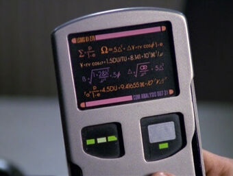
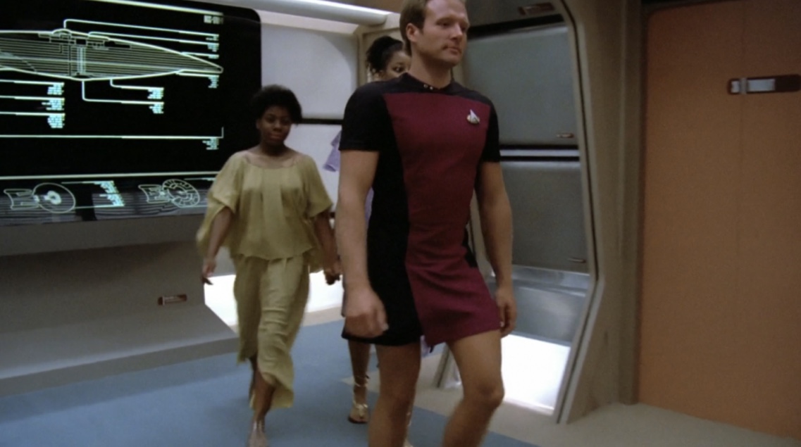
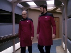
In Star Trek: The Next Generation and related series, we were introduced to the PADD, or Personal Access Display Device. While it looks a little clunky (think more along the lines of a modified Palm Pilot), it’s basically doing what your iPhone or Android device does today.

You hold it in your hands, you inter with it with your fingers or a stylus, and you carry it around with you.

The LCARS interfaces, or Library Computer Access and Retrieval System interfaces, allows the user to sit down and interact with a computer through a fully customizable touch interface. They’re built into walls, they’re built into consoles, and they’re built into desks in both vertical and horizontal orientation.

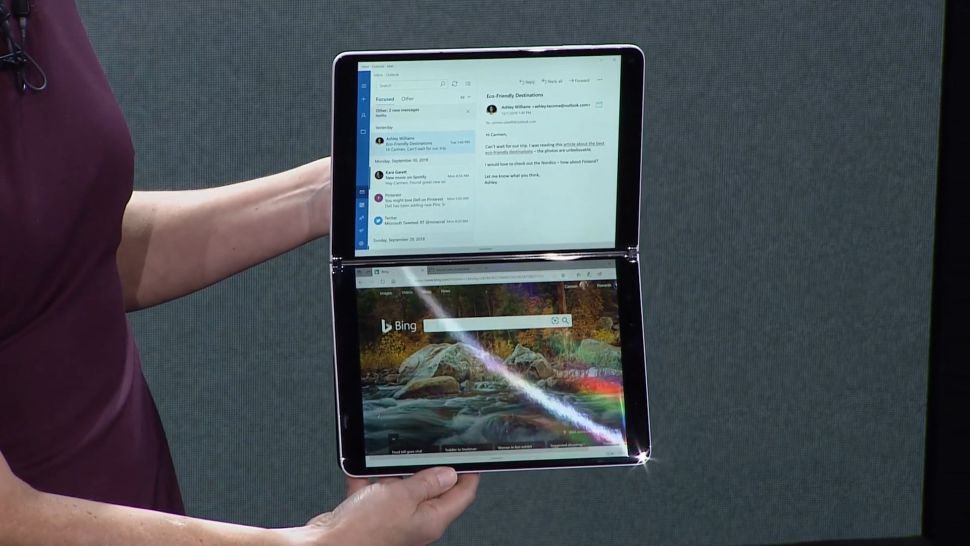
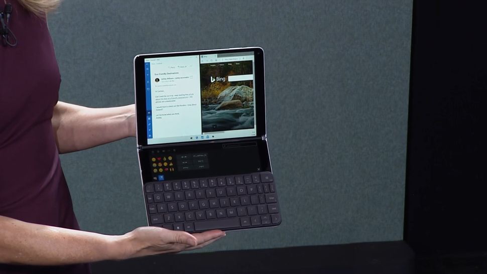
You know, much like an iPad or the upcoming Microsoft Neo.

Natural evolution of tech, especially the way we interact with technology, is awesome because we growth with it. We have adapted typewriter keyboards into the fastest way to input text into a computer. We develop touch interfaces so we can interact with the objects on the screen. We feel comfortable with using screens because our eyes allow us to focus on something as if we were reading a book. Our eyes have a target. We have something to look at.

A holographic project into mid-air does not give us something to focus on.

If you’re technically inclined and have a Mac (I don’t know if you can do this on windows), open a Terminal window. Go into Preferences and turn the opacity of your Terminal window down to 50%.

Now, start interacting through the keyboard interface. Type ls’ a bunch of times and try reading the screen. Force your eyes to focus on the letters in the terminal window and do your best to ignore the rest of your desktop coming through behind the lists of files displayed in the window.

Fatiguing, isn’t it?

I know holograms looks all flashy and futurey and make some viewers go wow and make other graphic designers get all tingly in their nether regions, but the fact of the matter is, folks aren’t going to enjoy trying to focus on words and pictures floating in the air. Human eyes aren’t designed for that. And they’re sure not going to like swiping and grabbing and flailing thin air. Flapping around like a chicken to do a Google search is not on the short list of efficient interface design.

I like future technology depicted when it makes sense. The flailing and swiping made little sense in “Minority Report” (though it was cool to look at), and it certainly doesn’t belong in Star Trek’s 23rd or 24th centuries.

Do we see Wolf Blitzer still interacting with holograms on CNN? He did it for one presidential election and it never came back. They now wow us with magic boards that work most of the time.

We want the future. We want technology to grow and do amazing things and solve insolvable problems. We want to see the stars and we want to meet other sentient beings throughout the universe.

We don’t need to have floating holograms when a simple console with touch interface will suffice.

The Honeymooners.

I didn’t really watch “The Honeymooners” until the mid 1980s. Back in the day it was shown in reruns on WPIX from New York at 11:30 PM, followed by the original “Star Trek”. After working second shift at a job, my boyfriend at the time and I would watch “The Honeymooners” and “Star Trek” before calling it a night. At the time, only the original 39 episodes were available; it would be a couple of years before Jackie Gleason found “The Lost Episodes” from kinescopes, it would be a little while after that where we could see the original sketches from Jackie Gleason’s Cavalcade of Stars.

While watching the original 39 episodes in perpetual rotation on WPIX, and having done so enough times to start knowing which episode was next and being able to recite lines, I mentioned to my boyfriend that Audrey Meadows wasn’t the original Alice. I don’t know how I knew this at the time; perhaps I had read it in a book or something. When asked who played the original Alice I barked out “Pert Kelton”. I didn’t really know who she was, I just knew the name and I knew she’d long been deceased at the time. You can’t help but bark her name when it’s nearly midnight, “Pert Kelton” just has a barky sound to it.

My boyfriend thought I was nuts (he never really got me anyway) and often scoffed off the useless knowledge in my head. A few months later from this revelation I went to the library and found a book that did indeed show Pert Kelton as the original Alice in “The Honeymooners” sketches on Jackie’s variety show. She was out because of the blacklisting during the McCarthy era. Audrey Meadows had her photo taken after just getting out of bed, all a mess in a frumpy dress, and Jackie gave Audrey the part.

I’ve seen a few clips of Pert playing Alice in various places on Youtube. Many of the comments talk about the bad actress playing Alice and how she’s too old and has such a nasally voice. In reality, Jackie thought Audrey Meadows was too young for the part, but she made herself look older.

From time to time I’ll watch interviews from the classier actors and actresses from a bygone era on Youtube, usually courtesy of the Foundation Interviews at the Emmy TV Legends website. An interview with Jayne Meadows talking about her sister Audrey and the role of Alice Kramden came up on my suggestion feed today, and Jayne tells how Audrey got the part of Alice and the comparison to Pert.

Imagine how much information I’d have rattling around in my head today if I had access to the Internet in the mid 1980s!

Write.

Since the first of the year I’ve been trying to take my work notes on my iPad Pro using an Apple Pencil. I’ve tried a couple of different apps designed for this, the stock Notes app, GoodNotes, OneNote, Notability and a couple of others. While they provided a good to very good note taking experience, I’ve never been satisfied with the result. Writing with an Apple Pencil is not as much like writing on paper with a great pen as it’s touted to be. And worse yet, organizing your notes and being able to find things a day or two later can be a bit of a challenge, especially if you’re not completely inside the Apple eco-system.

Prior to this iPad experiment I was using good, old-fashioned pen and paper. I have stacks of notebooks with all my work notes from over the years and the indexing system was by date and in my head. As I get older I find things are falling out of my head faster than they used to.

Enter Rocketbook.

I’ve talked about Rocketbook before. My husband and I discovered their product line a couple of years ago when they were on “Shark Tank”. Dressed in orange space suits, the co-founders of the company presented their plea for money from the sharks for a notebook that could be reused, simply by microwaving the notebook when it was full. Ink would magically disappear and you could use the notebook over again. The only caveat was you had to use a pen from the Pilot FriXion line. These pens use erasable ink.

The Rocketbook Wave was kind of nifty and I used it for a couple of cycles until I realized the pens made an impression in the paper, and even though the ink had disappeared, the impressions were everlasting. After two cycles through the notebook writing on a page was a bumpy experience.

Rocketbook now has the Rocketbook Everlast. This is a notebook that is erasable, but this time with a drop or two of water and a microfiber cloth. It’s like a notebook of mini-erase boards, but the cool thing is, using the FriXion pens, which now come in felt-tip marker-like instruments, there’s no impression. And, better yet, the ink sticks to the page after a couple of seconds and doesn’t smudge or wipe off like dry-erase markers. However, a couple of drops of water and that microfiber cloth and you can wipe the page clean and use it over again.

I’ve fallen in love with this approach.

The Rocketbook app lets you scan the pages and send them off to pre-determined destinations by marking icons at the bottom of each page. I have destinations in the company OneNote for team member notes, project notes, staff meeting notes, etc. And because it’s easy to sort and catalog notes, I can find things easily.

I’m really pleased with this system. They just started a Kickstarter campaign for a new product that involves templates and magnets holding pages in place and the like and I’m supporting their project.

I’m feeling more organized with this approach than I did with the Apple Pencil-iPad Pro system. I know it feels a little counterintuitive from my “technology is the answer for everything” mindset, but I’m really like writing my thoughts down, in my own handwriting, on a piece of paper, and filing it where I want it to be. There’s something memory-invoking about writing versus typing.

I’m feeling much more productive. And that’s always a good thing.

It Just Works?

I realize that the evolution is technology is making it more difficult to manage all the things we have going on with our devices. However, when you’re writing your own software exclusively for your own hardware, and charging a premium to be part of that experience, this should not be possible. This is not an example of “It Just Works”.

This screenshot is from the latest version of iPad Pro running the latest version of iPadOS. If user interaction elements just disappeared like this on applications built and maintained by my team at work I’d be calling meetings and having frank discussions with quality control.

There’s a reason I am reevaluating who I invest my money with to maintain my realm of technology.

Star Trek Future.

Cross-posted from Facebook.

Photo from syfy.

So I’ve been a Trekker since The Original Series. When I make my fan movie (which will live in the Voyager era) I’m using the theme from “Star Trek: The Animated Series”. In 1988 I sent storyboards to Paramount describing how the transporter should look in “Star Trek V: The Final Frontier”. (Voyager ended up with a very close representation of what I suggested but I doubt I had anything to do with it). I love the theme of hope, the better future, and the moving beyond many human failings that were depicted in all incarnations of Star Trek through “Enterprise”. 

We’ve been watching “Star Trek: Picard”. We subscribed to CBS: All Access just to watch. I wanted to love it. I was excited about Picard, Seven, and all that is Star Trek in the 24th century coming back to television. But while some of it feels familiar, I’m struggling with the swearing, the constant strife, and the use of very 21st century language. Name one place where Kirk said “groovy” or Deanna Troi said “rad” or “gnarly”. 

Why so much darkness? And don’t get me started on the vaping.

Prior to the 2010s, Star Trek has represented what we should be moving to: humanity getting better, evolving into a more caring species with a thirst for knowledge, exploration, and the betterment of the universe. Poverty, homelessness, the need for money: humans had moved beyond that. The “pew pew” was always a last resort. There were bad guys, there always will be, but Star Trek was classy and polished. I was hoping “Star Trek: Picard” would bring that back. 

I’m starting to doubt it will do that. You can put a fancy label on a cheap wine but sometimes that wine really does belong in a box.

I’ll finish this season but I hope it takes a turn for a brighter future soon.

Skant.

In the 24th century we won’t be as hung up on “gender norms” and what we’re wearing and what we’re suppose to wear and all that. At least, in the Star Trek universe it won’t be a big deal.

The first few episodes of “Star Trek: The Next Generation” had crew members, both male and female, wearing the “skant”.

Apparently this look never really caught on and was abandoned about halfway through the first season of “Star Trek: The Next Generation” (before River grew a beard).

Personally I was always a fan of first season Riker’s look, but then again at the time I was just happy to have Star Trek back on the air.

The skant persisted in a modified form, making its way as a dress uniform, this time with pants underneath.

I don’t think the skant ever made it to the later uniform styles but I did enjoy it’s appearance back in the day. Even if it was just to prove that in the future we would get beyond trivial things like what men and women we’re wearing.

IDIC.

Improvements.

Apple Maps is a classic example of what happens when you don’t have the software where it needs to be upon its initial release. Despite all of the improvements Apple has made over the years, Maps still has a poor reputation. Google Maps seems to be the default choice of users, even those using iPhones and the like.

Recent improvements to Apple Maps have been impressive. Signalized intersections are now marked with a stop light icon. Speed limit data was accurate through a construction zone.

Personally I like Apple Maps and I find the quality on par with Google’s counterpart. Yelp integration is nice, the only step I’d ask Apple to take is to not require opening the Yelp app for diving into details on a location.

iHistory.

Yesterday was the 10 year anniversary of the announcement of the iPad. I remember watching the announcement with great interest but it wouldn’t be until the end of 2010 when I bought my first iPad. Oddly, I can’t easily find any photos of my first iPad in Photos, but I did run across a photo of me and my very first iPhone back in 2008.

There wasn’t an app store back then, as the plan was “apps” would be served through HTML5 web apps on Safari. Looking at the photo, two things quickly catch my eye: I had awesome sideburns (in ginger!) and the row above the dock had a right justified app icon, something you can’t do today on the iPhone or iPad.

I found an early screen shot from my iPhone 3G, after apps had been introduced to the ecosystem.

There’s plenty of familiar apps on that screen, albeit with ancient icons, but I don’t remember off the top of my head as to what “Zite” did.

** One moment.

A quick DuckDuckGo search reveals that Zite was an aggregator: news magazines, videos, blogs, and the like all came together in one app called Zite.

I still don’t remember it.

So I started this blog entry by remembering the 10 year anniversary of the iPad. Once I had an iPad I remember it took a little while for me to warm up to it. At the time I was still quite much in love with my Macs and iPhone and the iPad seemed like an intermediate device. Maybe extraneous.

Fast forward 10 years and my 2018 iPad Pro is my primary computer. I have it in tow all the time and I keep tweaking and making my personal experience better. I honest believe tablet computing, when does as well as the iPad, which is far and beyond anything else currently offered, is the future. My mom has an iPad as her primary device, my husband has an iPad, my nephew has an iPad. We don’t really need huge laptops anymore. For basic computing, when it comes to browsing the internet, tweeting, email, Facebook, and chatting with others through the various channels, iPads fit the bill, it’s simply a matter of thinking outside the box.

Happy birthday, iPad! I wish I could find a photo of my original iPad because I’ve been quite delighted since I first laid my hands on you.

Availability.

I love when technology is used for something sensible. I’m not talking about giving us the ability to watch videos of people falling down on the ice or lending voice to anonymous rage fests on social media. No, I’m talking about technology that makes our life just a little bit easier without taking over the situation completely. You know, the stuff that actually helps us.

My husband and I ventured over to “Fashion Outlets of Chicago”, a mall situated near O’Hare. As the name suggests, this mall is loaded with stores and shops of an outlet and bargain basement nature. Amongst the gaiety is situated a food court. When I ordered a “diet pop”, a perfectly natural request in the Midwest, the clerk laughed out loud and proceeded to say “pop” in unnatural tones. Apparently I was on the wrong side of town for a diet pop.

I’m digressing.

To initiate our venture to “Fashion Outlets of Chicago” we drove the car. It’s always a bit of pain driving in the city, especially in the winter when everyone forgets how an automobile works, how roads work, and how various other necessities of a motorized society works, but nevertheless I ventured us over to the parking garage attached to the “Fashion Outlets of Chicago”.

I was pleasantly surprised with the technology in use in the parking garage.

  1. Electronic signs indicated how many spots were open on any of the multiple levels of the garage
  2. LED lights over each spot showed red or green indicating the availability of the parking spot, and these lights were easily seen from all over the garage
  3. Displays at the end of each row displayed the number of open spots per row, letting you know if you should venture down a row or not looking for an available parking space.

This practical use of technology made whipping the Jeep Cherokee around this garage just a little more pleasant than it otherwise would have been. The stress of parking was reduced just enough to make the “Fashion Outlets of Chicago” a bit more pleasant of an experience.

I hope this parking technology catches on elsewhere. It’s the little things that make a difference.

Simplicity.

This is my alarm clock.

After spending time on and off my nightstand for the past weeks and months I’ve decided that it belongs on my nightstand.

This alarm clock, purchased during my senior year of high school, has worked reliably since 1986. It keeps time as well as the power grid will allow it, it can tune in both AM and FM radio stations using the antenna built into the power cable and it’s simple to set and easy to synchronize to an atomic clock.

My mid-1980s vintage General Electric alarm clock doesn’t require updates, doesn’t need to reboot, and uses LED digits that do not blind me in the middle of the night. I can’t talk to it and it doesn’t talk to me, but it does wake me up every morning with the sounds of NewsRadio WBBM.

I have flirted with other alarm clocks, especially over the past year or two. An Alexa Dot that featured a round face, the eerie laugh of Alexa in the middle of the night, and a camera pointed at my slumbering visage. I most recently tried a Lenovo Smart Clock, powered by Google Assistant. Using a miniaturized version of the Google Assistant software found on the Google Nest Home Hub, it likes to update in the middle of the night and shine LED backlighting on my eyes. Sometimes I wake up with a sunburn.

Luckily, I bought it during the holidays for over 50% off. I didn’t enjoy it as much as I thought I would.

After swapping between my old reliable GE and the Lenovo for the past week I’ve settled with sticking with the tried and true. The red digits make no impression in the darkened room when we’re sleeping and the alarm is always on time.

Sometimes you just have to keep it simple.