OK, let me start this post with two important notes, actually three important notes:
1. This is another Macboy related post.
2. I really am a developer so everything I obtain is via legitimate means.
3. I’m scared to death of Apple so I won’t post screen shots or go into specific details of what I’m experiencing whilst beta testing.
As I mentioned in my post yesterday, Apple previewed their newest versions of iOS (for the iDevices), called iOS 7, and OS X (for the Macs). The newest version of OS X breaks the tradition of being named after big cats and is called OS X Mavericks.
I’m not a huge fan of the name but it works for me. I still think “Sea Lion” would have been kind of fun.
As an OS X and iOS developer, I utilized my vast developer powers and installed the beta versions of each of these new offerings on my test devices. These are my gut reactions after just over 12 hours of experience with the new platforms.
Surprisingly, my old MacBook Pro from 2008 runs OS X Mavericks in its current incarnation just fine and it seems a little snappier than OS X Mountain Lion. There are some subtle changes in the interface that I certainly appreciate and it feels quite comfortable to me. One of the things that I really like is the deeper integration with iOS; it’s kind of cool being able to find a place in Maps on my Mac and send the information to my iPhone automagically. I know, I know, others have been able to do this for a while but the bright spot of doing it on OS X is that I don’t have to see an advertisement whilst doing it. OS X Mavericks is a comfortable evolution that I am thoroughly enjoying.
iOS 7 is more than an evolution, it’s an abrupt change.
Keeping in mind that I am running beta 1 of iOS 7, there are some things that I am finding a little confounding.
First of all, I don’t understand this obsession with Helvetica Neue as the default font. Anyone and everyone is looking to make their logo and other typography as svelte as possible with Helvetica Neue.
I believe that if you’re going to say something, say it boldly and Helvetica Neue is anything but bold. In fact, it can be a little rough on the eyes. But it’s EVERYWHERE in iOS 7 and I guess there’s not a dang thing I can do about it.
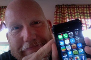
There has been a lot of chatter about the new icons in iOS 7 and I have to admit that I agree that they feel like they’re missing some of the polish that I have grown to love about Apple. I don’t know that “cartoonish” is a word that I would use; they just feel amateurish to me, almost as if they were an afterthought. There’s a certain lack of class. Maybe these are just placeholders until the real things come out because of course, this could all change at a moment’s notice and it probably will.
That all being said, I like the way that iOS 7 works. I had to make some changes to muscle memory when it came to handling email (I apparently used to swipe the wrong way?) but otherwise in that respect iOS 7 feels more familiar to me than I thought it would. The change isn’t as jarring as say, moving to an Android device. I really like the animations and the slight 3D effects. Of course, this is style over substance but I think it does contribute to the spit and polish that Apple is known for.
There is a feature missing in iOS 7 that I hope will return in later releases and that’s the “Tap to Tweet” and “Tap to Post” buttons in the notification center. I LOVED being able to be witty in 140 characters or less by just typing my hilarity in a pull down box and then going on with life. That functionality is missing right now and it’s kind of a bummer to have to open up my Twitter client (I use Tweetbot) to be witty. Half the time the moment has passed.
The Sybil sides of me have been hot and cold about iOS 7 over the last 12 hours, but the sensible side of me has been determined to just calm down and make a fair assessment of the new experience.
I’m looking forward to seeing how iOS 7 and OS X Mavericks progress.

